
Introduction
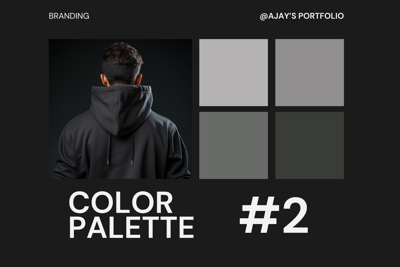
Choosing the right color palette is a core part of brand design. Colors evoke emotions, tell stories, and define how a brand is perceived. A carefully selected palette enhances brand recognition and sets the tone for communication.
1. Understand the Brand Personality
Your first step should be to define what the brand stands for. Is it, trustworthy, luxurious, or playful? Choose colors that align with these values. For example, a health-conscious brand may go for greens and earthy tones, while a tech startup might use modern blues and purples.
2. Know Basic Color Psychology
Each color carries psychological meaning:
- Red: Excitement, urgency
- Blue: Trust, reliability
- Yellow: Cheerfulness, optimism
- Green: Health, freshness
- Black: Luxury, power
These emotional triggers should align with your brand message.
3. Consider the Target Audience
Colors appeal differently based on age, gender, culture, and preferences. Research who the brand is talking to and adjust accordingly. For instance, vibrant hues might suit a teenage audience, while muted tones may appeal to a luxury demographic.
4. Stick to a Balanced Palette
Avoid overwhelming the viewer. Use a combination like:
- Primary colors (1–2 key shades)
- Secondary colors (1–2 supporting hues)
- Accent color (for buttons, highlights)
5. Check Contrast and Accessibility
Good design is inclusive. Ensure text is legible against backgrounds and consider users with visual impairments. Tools like WebAIM or Adobe Color help test contrast levels.
6. Test Across Mediums
Your palette should look consistent on digital screens, print, and packaging. Always preview designs in different formats to ensure visual consistency.
Conclusion
A color palette is more than just a design choice — it’s a branding tool. When chosen strategically, it strengthens a brand’s identity and builds emotional connection with its audience. Take the time to research, test, and refine your choices.